

Food Exhibition
NINE
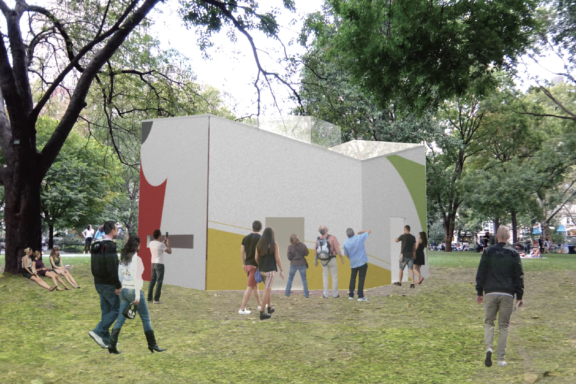
This project is and installation exhibition using the concept of Gu-JEOL-PAN which is one of the traditional Korean foods in South Korea. The name and space of the brand were designed using a nine sectioned plate, one of the features of this food. I created a variety of program based on the concept of “HARMONY” by using both characters Madison Square Park, NY where is an exhibition site about the food. Through this exhibition, people can refresh from their daily life and experience Korean food through other senses and spatial installation.
OVERVIEW
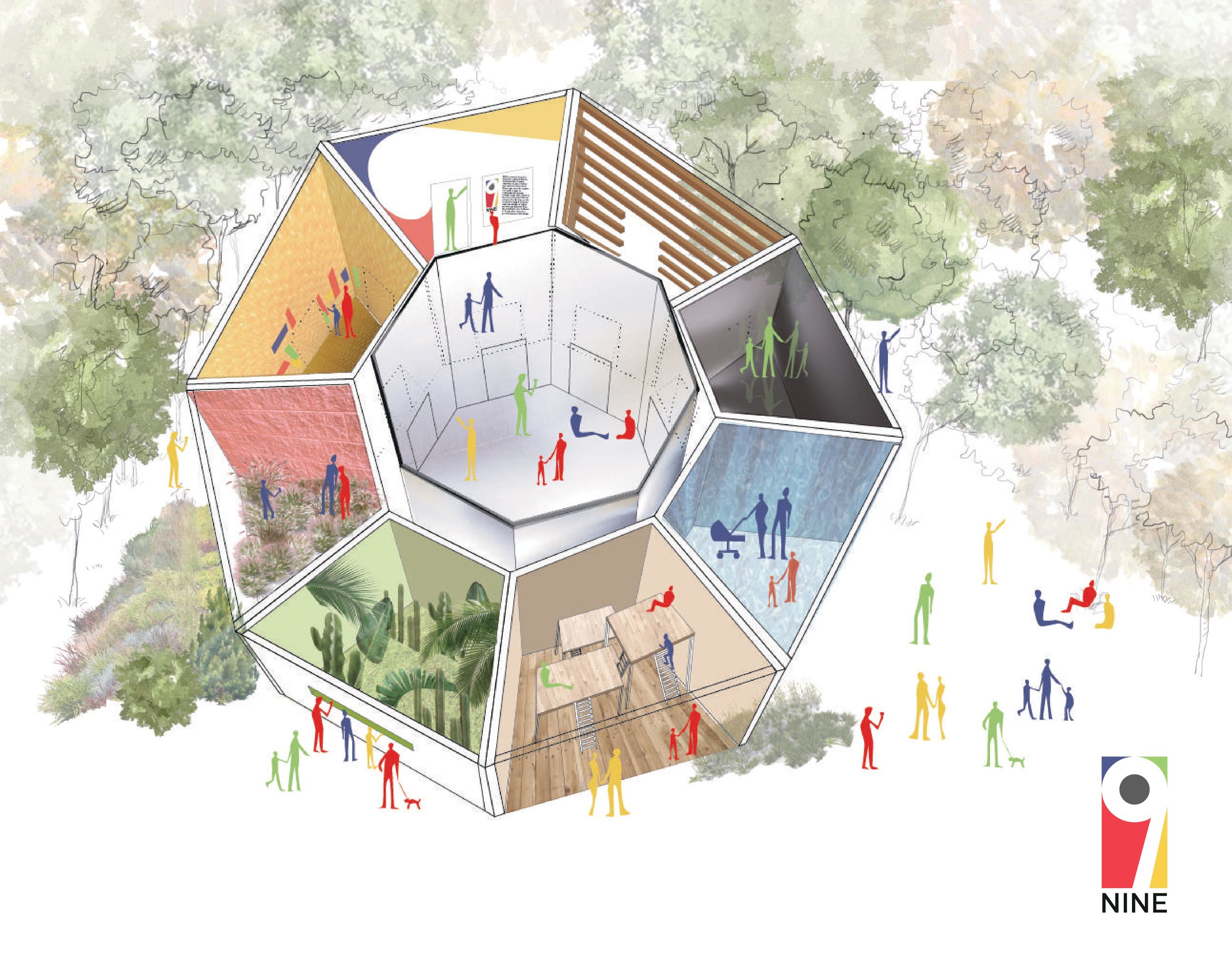
FOOD “GU-JEOL-PAN”


A Gu-Jeol-Pan is a traditional royal food in South Korea. It refers to a platter with nine sections that are used to serve traditional delicacies. “Gu” means the number 9, “Jeol” means section, and “Pan” a tray or a platter. In Asian culture, the number nine holds a symbolic meaning of fullness and harmony. Gujeolpan is a dish that reflects that meaning by offering a harmony of colors, textures, and nutrients. The dish usually contains different vegetable, meat, and seafood.
SITE ANALYSIS: Interview

BRAND IDENTITY “OH-BANG-SAEK”


Obangsaek - white, black, red, yellow, and blue, which represent hoe and longevity. The energy of the Yin and Yang came to the heavens and the earth, and the two winds of Yin and Yang created the five branches of wood, fire, earth, gold, and water. It is based on thought. There are five colors followed by the defense.


